Project Page Overview
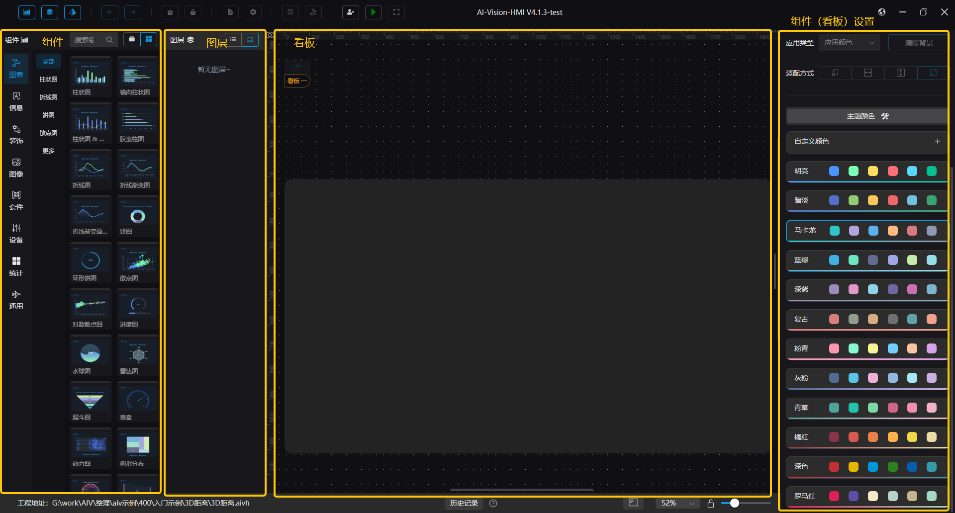
The overall layout of the project page is divided into four main parts: Component Selection, Layer, Dashboard, and Component (Dashboard) Settings.
HMI Usage Process
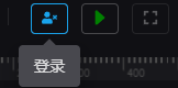
When opening the HMI for the first time, it is in an unlogged state, supporting only login and run operations. You need to click the user icon in the upper-right corner of the project page to log in.
If it’s your first time using the HMI, you can import a template after logging in to reduce setup steps.

When creating a project for the first time, you must log in and set a password. The password can later be modified in System Settings. The login password is stored in the .aivh file. After importing an .aivh file, you will be automatically logged out.
Top Toolbar Shortcuts
| Icon | Name | Description |
|---|---|---|
 | Chart Component Control | Controls whether the chart component area is displayed |
 | Layer Control | Controls whether the layer area is displayed |
 | Detail Settings Control | Controls whether the settings area is displayed |
 | Forward | |
 | Backward | |
 | Import | Open an HMI file |
 | Export | Export the current HMI file |
 | Import Template | Import an HMI template |
 | System Settings | Open the system settings panel |
 | Save | Save the current HMI file |
 | Save as Template | Save the current file as a template |
  | Login / Logout | |
  | Run / Return | |
 | Fullscreen | Enable fullscreen display during runtime |
HMI cannot be run without authorization. If the trial period expires while running, a “Trial Expired” message will pop up.
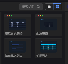
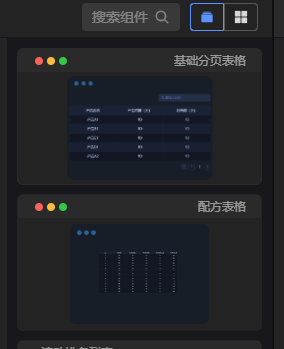
Component Selection Area
Components are divided into eight main categories: Chart Components, Information Components, Decoration Components, Image Components, Suite Components, Device Components, Statistical Components, and General Components.
Components in the selection area can be added to the dashboard for display.
1. Display Components
There are three ways to add components from the selection area:
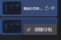
a. Drag and drop directly into the dashboard area b. Double-click the component c. Click the search bar, then click the matching component

When adding via double-click or single-click, components are placed in the top-left corner of the dashboard by default.
2. Component Columns
The component list supports single-column and double-column views. You can switch between them using the button next to the search box.
| Icon | Name | Description |
|---|---|---|
 | Double Column | |
 | Single Column |
3. Show Categories
When there is only one type of component, the category is hidden by default. You can enable “Show Categories” in System Settings.

Layer Area
The Layer Area is mainly used to control components within the dashboard. It includes both grouped components and individual components. Clicking a component displays its corresponding settings on the right.
The order of components in the layer area corresponds to their z-index in the dashboard. Components higher in the list appear above others in the dashboard.
1. Display Mode
The layer area supports both list view and thumbnail view. You can switch modes using the buttons at the top.

2. Grouping
Grouping operations include Create Group and Ungroup.
| Icon | Name | Description |
|---|---|---|
 | Create Group | In the layer area: hold Ctrl and select multiple components → Right-click → Create Group or use Ctrl+G shortcut |
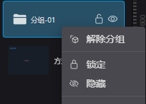 | Ungroup | Right-click group folder → Ungroup or select group and use Ctrl+Shift+G |
Components can also be selected or right-clicked directly in the dashboard. Multi-select shortcut: Ctrl + Left Mouse Click
3. Right-Click Menu
Right-clicking a component or group displays a contextual menu.

| Name | Description |
|---|---|
| Lock | Locks the component; locked components can only be modified from the layer panel |
| Hide | Show or hide the component in the dashboard |
| Copy | Shortcut: Ctrl+C |
| Cut | Shortcut: Ctrl+X |
| Paste | Shortcut: Ctrl+V |
| Bring to Front | Moves component to the top of the layer stack |
| Send to Back | Moves component to the bottom |
| Move Up | Moves component up one layer |
| Move Down | Moves component down one layer |
| Clear Clipboard | Clears current clipboard contents |
| Delete | Deletes the selected component |
Lock and Hide can also be toggled by hovering over the component in the layer list and clicking the corresponding icon.

Layer hierarchy decreases from top to bottom. Components within a group share the same level.
Dashboard Area
The dashboard area is divided into the main dashboard and the bottom toolbar.
1. Dashboard
The dashboard is where all components are displayed. Clicking a component or the dashboard will show its settings on the right. You can adjust component position and size directly on the dashboard.
| Operation | Description | Illustration |
|---|---|---|
| Move Component | Hold left mouse button to drag, or use Ctrl + Arrow Keys | |
| Resize Component | Select and drag to resize |  |
| Zoom Dashboard | Ctrl + Mouse Wheel | |
| Pan Dashboard | Drag the right or bottom scrollbars |
The move distance for keyboard operations can be configured in System Settings.

2. Bottom Toolbar
 From left to right: current .aivh file path, history, history notification, shortcut key hints, dashboard zoom options, lock/unlock zoom ratio, and zoom slider.
| Icon | Name | Description |
|---|---|---|
 | Project Path | |
 | History | Records user operations, up to 100 entries |
 | History Notification | |
 | Shortcut Key Hints | |
 | Zoom Options | Controls dashboard zoom ratio; options include Auto, 50%, 100%, 150%, and 200%. Auto restores default zoom and centers the view |
 | Lock/Unlock Zoom Ratio | Locks current zoom; disables zooming with Ctrl + Mouse Wheel and other zoom controls |
 | Zoom Slider |
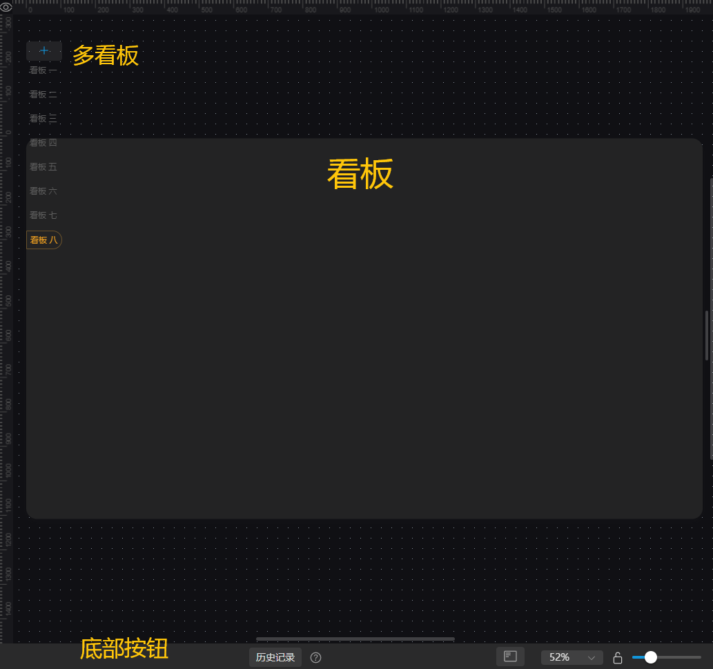
3. Multi-Dashboard Mode
HMI supports up to 10 dashboards. Click the "+" button above to add a blank dashboard, the clone icon on the right to duplicate, or the X icon to delete one. 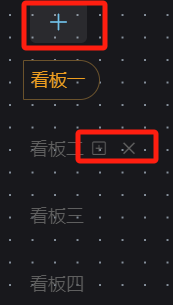
Component (Dashboard) Settings Area
1. Dashboard Settings
The right settings panel shows Dashboard Settings by default. Clicking on the dashboard displays its configuration options, divided into Page Configuration and Theme Colors.
a. Page Configuration
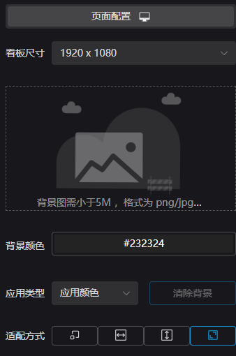
The dashboard background can be set by clicking to select or dragging an image (some components also support drag-and-drop). The Fit Mode determines how the dashboard appears in preview mode.
b. Theme Colors
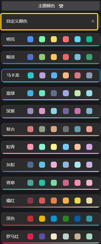
Theme colors define the color scheme for chart data. In addition to built-in color themes, users can click Custom Colors to open the color configuration page and add their own themes.
2. Component Configuration
This section controls component display settings.
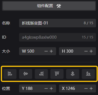
The six central buttons control component alignment within the dashboard — from left to right: Align Left, Align Vertically Center, Align Right, Align Top, Align Horizontally Center, Align Bottom.
This section only covers common settings. For component-specific details, please refer to Common Components.