Only commonly used components, partial style settings, and data source configurations are introduced here.
Chart Components
1. Common Settings
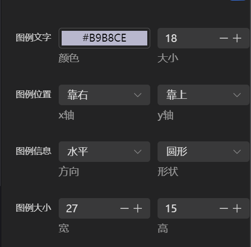
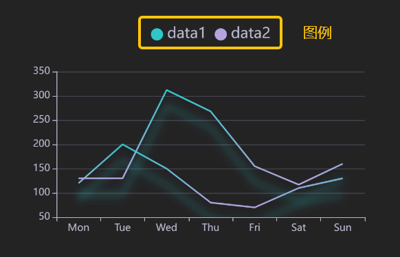
Legend Settings
2. Bar Chart & Line Chart
Bar charts and line charts have unique settings for X-axis, Y-axis, and bar/line settings.
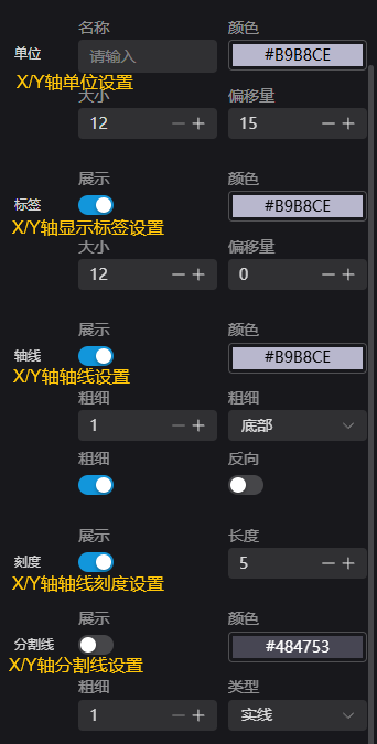
a. X-axis & Y-axis Settings
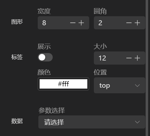
b. Bar Settings
Configure the display settings of the bars. Dynamic bar data comes from global variables in Studio.
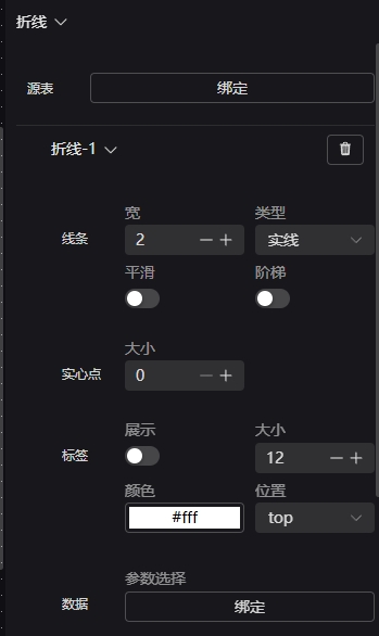
c. Line Settings
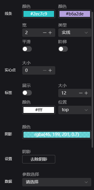
This section configures the display of lines. Dynamic line data comes from global variables in Studio.
A line chart can store up to 1000 records or two hours of data. The storage amount can be adjusted in System Settings.
3. Pie Chart
Pie charts have unique Pie Configuration and Pie Data settings.
a. Pie Configuration

b. Pie Data
Refer to the Line/Bar Chart section for binding Studio parameters.
Information Components
Style settings will not be described in detail.
1. Script Output & Text Components
The Log Component only supports binding string-type parameters. The maximum stored data volume can be adjusted in Global Settings.
The Text Component supports binding string and number type parameters.
2. Tag Selector Component
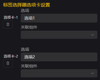
The Tag Selector Component supports binding to all components within the current canvas except itself. It is used to toggle the visibility of bound components.
The Tag Selector supports binding to a single component. To bind multiple components, group them and bind the group.
3. Basic Paginated Table
The Paginated Table Component supports binding to number-type parameters to display runtime data from Studio. The maximum stored data volume can be adjusted in Global Settings. The first column is the time column, with adaptive width. It supports options such as row/column indicators, auto column width, and fixed first column.
Decorative Components
Style settings will not be described in detail.
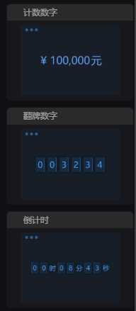
These components are mainly decorative, including border components, decorative shapes, title components, and mini widgets.
Among the mini widgets, the number counter, number flip card, and countdown components bind to number-type parameters.
The Weather Widget displays current weather directly when dragged in. The system default weather API key has usage limits. It is recommended to set your own key obtained from Amap Developer Platform.
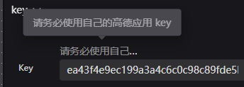
Image Components
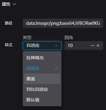
Style settings will not be described in detail. Image components allow users to upload custom pictures.
Image Properties:
| Name | Description |
|---|---|
| Stretch Fill | Stretches or compresses the image/video to fill the container, not preserving aspect ratio. |
| Contain | Scales the image proportionally to fit entirely within the container (may leave blank space). |
| Cover | Scales the image proportionally to fully cover the container (may crop content). |
| Contrast Contain | Scales down proportionally so the image does not exceed the container; if smaller than original, shows original size. |
| Default | No resizing; the image/video displays at its original size. |
Control Suite Components
Style settings will not be described in detail.
The Run Control Group includes:
- Run Status Icon
- Pause Icon
- Run Icon
- Loop Run Icon

Device Components
Style settings will not be described in detail.
Device components are I/O components. The bound parameter must be an array of length 16, where each item is 1 or 0: 1 = red point, 0 = white point.

Statistical Components
Style settings will not be described in detail.
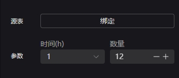
1. Vertical & Horizontal Yield Bar Charts
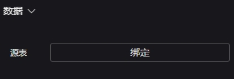
These components display historical production output, requiring a linked database. First, select the data source table, then choose parameters to display.
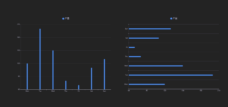
Source Table: The bound database table Parameters: Define time and quantity — e.g., time = 1h, quantity = 12 → show data within 12 hours
2. Data Line Chart
This component displays data from each column in the database. Select the data source table first, then bind each line to a column.
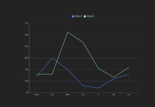
Line: Customize width, size, and number of lines (add/delete). Source Table: Bound database table Data: Bind one column’s data to Line-1
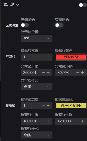
Warning Lines: Set alert or threshold lines.
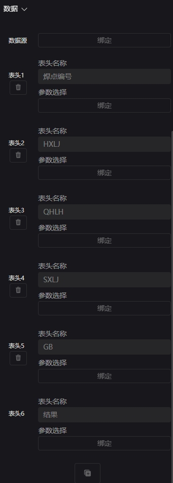
3. Single Statistical Table
The data source must first bind to a Studio variable, then bind each column accordingly. The variable format must be a JSON string, e.g.:
[{GB=0.0, SXLJ=0.0, QHLH=0.0, WeldPoint=1.0, result=0.0, HXLJ=0.0},
 {GB=0.0, SXLJ=0.0, QHLH=0.0, WeldPoint=2.0, result=0.0, HXLJ=0.0},
{GB=0.0, SXLJ=0.0, QHLH=0.0, WeldPoint=3.0, result=0.0, HXLJ=0.0}]The
resultcolumn must be included in Studio creation.
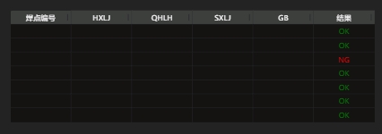
Data Source: Bind to a global variable in Studio (column count must match). Header: Bind one column and rename the header as needed.
4. Recipe Table
Displays Studio recipes directly without complex configuration. To edit, click Modify Table Data → Edit.
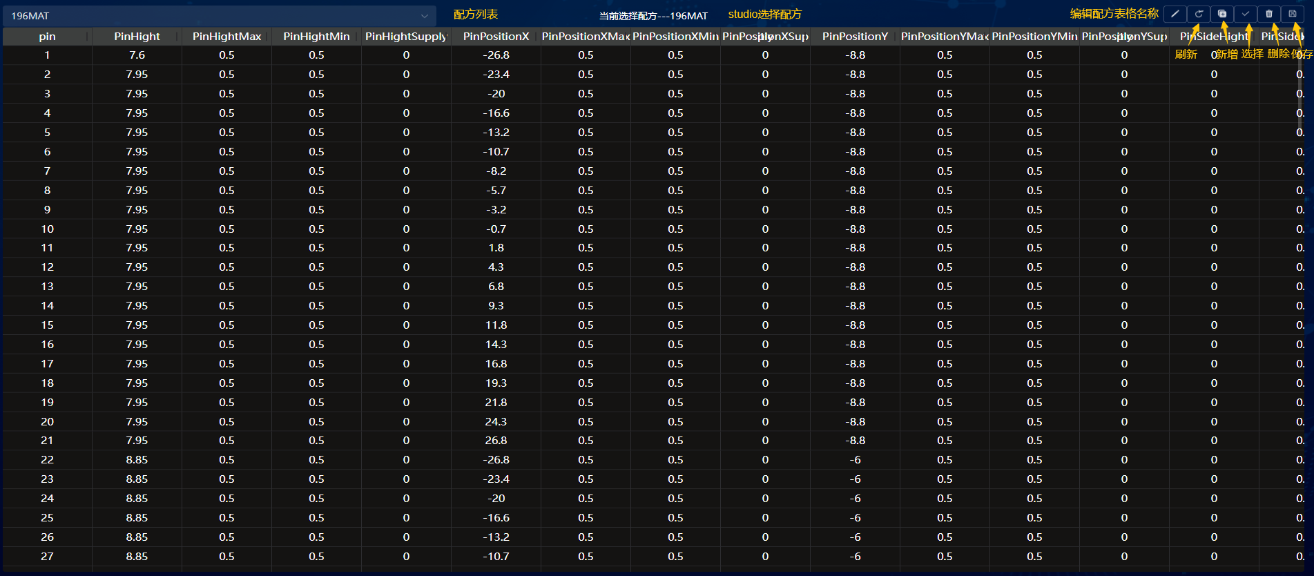
| Icon | Name | Description |
|---|---|---|
 | Edit Button | Edit recipe table name |
 | Refresh Button | Refresh HMI after Studio table changes |
 | Add Button | Upload a new local recipe file |
 | Select Button | Use the current recipe file in Studio |
 | Delete Button | Delete the current recipe file |
 | Save Button | Save changes to the recipe file |
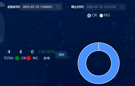
5. Historical Query Table
Supports querying historical data and repeated queries. Bind the source table, choose query conditions, and run search.
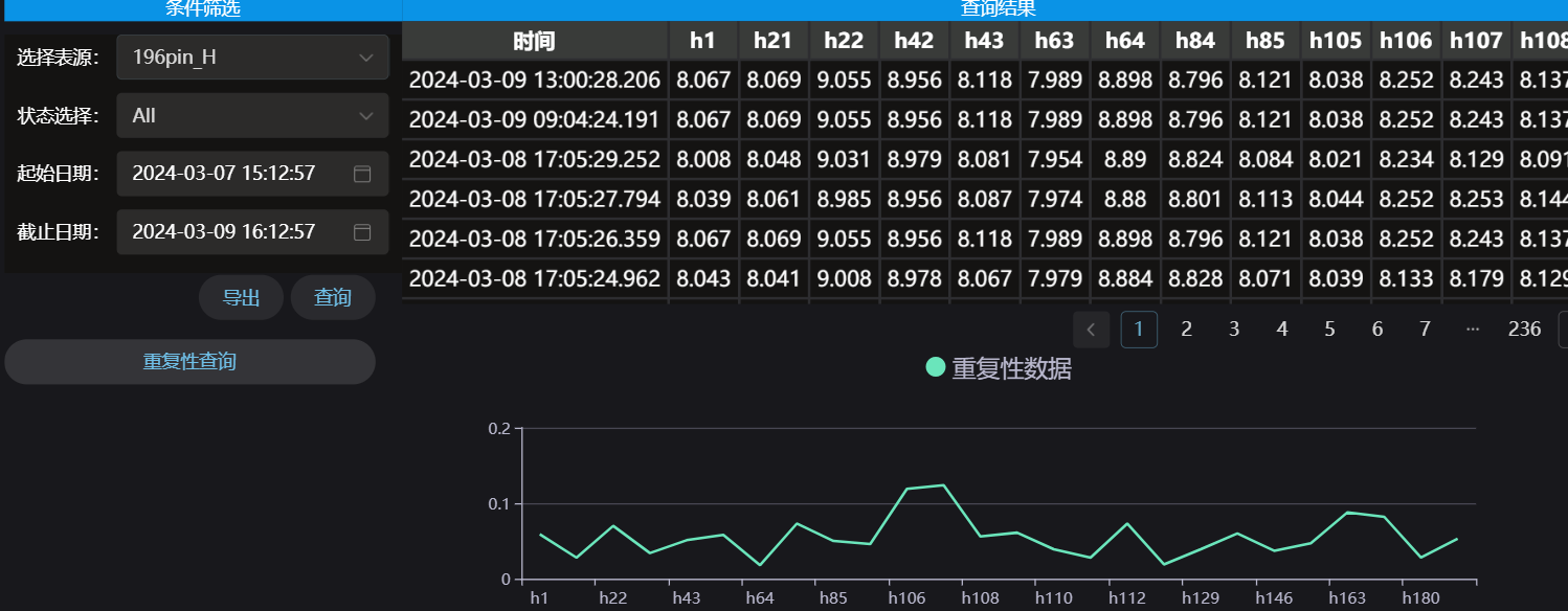
Select Table Source: Choose the database from Studio project Status Filter: View results of ALL / OK / NG Start/End Time: Select time range for data Query: Click to update displayed data Export: Export current table view Repetitive Query: Display a line chart showing repeated data statistics
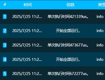
6. Event Notification Table
This component works automatically once placed on the dashboard—no configuration needed. It logs and scrolls system events (e.g., Studio TCP Server status changes).
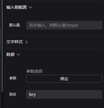
7. Parameter Edit Box
Binds to a Studio global variable. At runtime, modify its value using the Save Dashboard Variable icon or button event.

Input Box Config: Set default value Parameter: Bind target global variable Alias: Rename parameter
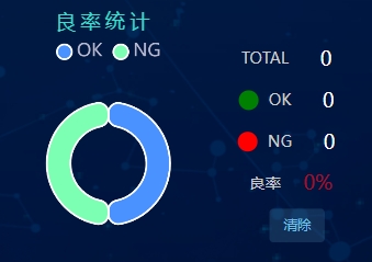
8. Yield Statistics
Displays OK, NG, and Yield Rate as text or pie chart. Data comes from the database defined in Studio.
9. System Information
Displays basic system information such as CPU and Memory usage.

10. Yield Query
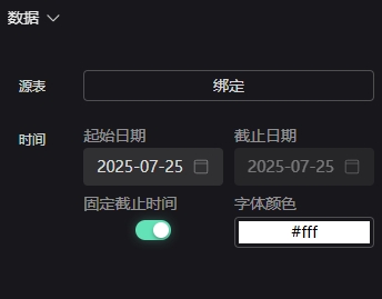
Displays historical yield data from the database within a selected time range.
Source Table: Bind database from StudioTime: Choose start and end dates
General Components
1. Icon Components
Style settings will not be described in detail.
The Icon Component includes six built-in icons: five operation icons and one page icon.
Operation icons:
- Pause
- Run
- Loop Run
- Run Status
- Save Dashboard Variable
Operation icons are linked to Studio functions — they control runtime actions and can be used directly.
| Icon | Name | Description |
|---|---|---|
 | Pause | Pause running program in Studio |
 | Run | Execute the entire Studio program once |
 | Loop Run | Continuously execute Studio program |
 | Run Status | Green when running, red when stopped |
 | Save Dashboard Variable | — |
Page Icon: Full-Screen Toggle Can be used directly; controls page display state.
| Icon | Name | Description |
|---|---|---|
 | Full-Screen Toggle | Switch between full screen and windowed mode |
2. Image Components
Style settings will not be described in detail.
| Icon | Name | Description | Settings |
|---|---|---|---|
 | 1D Image | — | — |
 | 2D Image | — | — |
 | 3D Image | 3D display component allowing selection of different scene IDs. Ready to use without extra setup. |  |
3. Square Button Component
Style settings will not be described in detail. The Square Button has two states, with customizable default display state and state-switch triggers (click, double-click, right-click, etc.). Each state has its own style and event configuration.
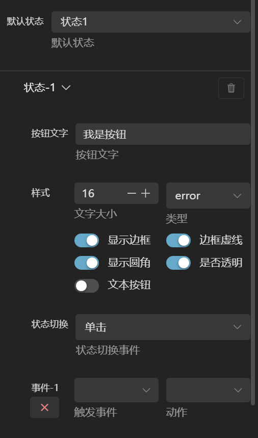
The event module includes Trigger, Action, and Target.
| Name | Description |
|---|---|
| Trigger | Includes Click, Double-click, Right-click, Mouse Enter, Mouse Leave |
| Action | Dashboard Switch, Pause, Step Run, Loop Run, Save Variable, Fullscreen, Exit Fullscreen |
| Target | Defines action target; only Dashboard Switch uses this option (specify which dashboard to open) |